Vancouver - The Last Month
![[text-only graph here]](history-ll.png)
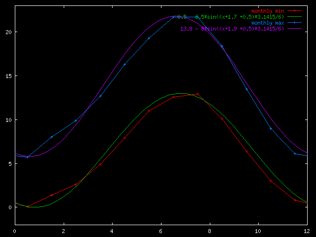
Dashed lines are a simple curve fit to the Climate since 1961.
The green lines are the approximate measured average daily min and max for the last month.
If we have had a normal month they should line up with the dashed lines.
![]()
![]()
![]()